Thursday, 20 October 2011
B: The call sheet and risk assessment in preperation for half term.
Group: The Animatic for our Storyboard.
Here is the animatic for our video...
K&B: Storyboarding our concept
Storyboards are graphic organizers in the form of illustrations or images displayed in sequence for the purpose of pre-visualizing a motion picture, animation, motion graphic or interactive media sequence.
The main reason for us creating a storyboard is to get a visual representation of what our video will look like as well as to plan for time and specific shots.
On Tuesday the 18th October we created our storyboard for the main shots in our video, these included...
-The tree shots
-The Girls Body shots
-The boy's lip syncing shots
-The final shot of the girl
-The Fire station shots
- Other location shots
-Nature Shots
-Tea light shots
- Rope shots
- Lantern shots.
The storyboard consists of...
- A sketch of the shot
- The distance of the shot
- The movement in the shot
- A description of the shot
- The time of the shot.
Next lesson we need to create an animatic for our storyboard.
Tuesday, 18 October 2011
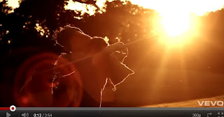
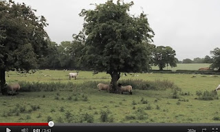
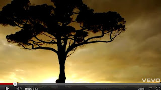
K&B: Calverly inspired shots

K&B: Concept update
K&B: UPDATE
Kitty: portsmouth harbour
Becki: owl shots/dog shots
Group: brighton
We uploaded and have cut the footage into the timeline. At this point we need to re look at our secondary research to observe the editing style and cutting rate again; we will then be able to begin editing this footage appropriately.
K&B: Shot list
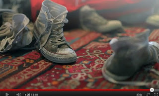
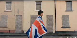
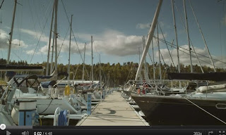
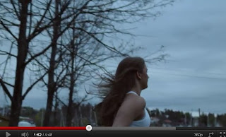
After revising the 'Isles' video by Little Comets and our other secondary research such as 'Big Day' by Torgny we have broken down our concept into a shot list to complete.
Our first shoot will take place this Saturday in Calvarly Park, Tunbridge Wells. We will be filming the following shots:
- Rope shots (close up)
- Feet shots (hanging / out the car / converse on grass-CU)
- Hair shots (running blowing in the wind)
- Hand holding mask
- Other body shots
- Girl standing by tree
- Mask shots
- Tea light/lantern shots
- Balloon shot
- L: Masks
- L: Rope
- K/L: Converse shoes
- K/B: Tealight
- B: Fire lantern
- B: Balloons
- K/B: White dress
- K :camera
Becki will be doing a shoot between the monday and thursday during halfterm where she will film random people and areas in Hastings, the fire station (Southborough) and extreme close ups of people's faces. Kitty and Becki will then meet on the friday to exchange the camera and equipment where Kitty will do a shoot on her trip to Dartmouth (Devon) including shots of the harbour, with focus on love; our male character lip syncing and looking around/running and a busy city shot possibly.
Lip syncing lyrics: So dont, dont you forget, that rope you tied around your neck, dont free your darling, dont free your darling.
The following week back at school we aim to capture the footage and decide whether reshoots or more footage is needed, we will also plan to film our horses and deer running shots.
B: Owl Shoot/ Dog shoot
Here is the call sheet and Risk assessment:
Friday, 14 October 2011
B: What we need to do next
-Find props to be used, so that we can ensure that we are prepared for our filming
-A shot list so that we ensure we will incorporate all the shots in which we have planned and will have enough shots when it comes to editing our final piece.
-The shot order to ensure that we keep continuity and will make it easier when it comes to editing our piece.
-To split the shots between the group for personal filming.
-To plan a day for filming as a group, decide what needs filming on that day.
-Upload track onto timeline, ready for editing.
-Upload and edit recce from Brighton etc.
K&B: The Pitch
The overall feedback that we got from our pitch was positive, the design and presentation of the pitch was effective and the colours worked well to illustrate our genre. The background image of the sun set is reflective of our lighting and setting in that we aim to create for our video.
Wednesday, 12 October 2011
B- Script for the pitch
- Audience research
- Treatment
-Track and initial ideas
- Digipak
- Advertising.
Read treatment!
Audience research
Our target audience
SLIDE
Our research consisted of survey monkey and two focus groups, one by Kitty and one by me
Here is the data from my focus group
First we found out basic audience information such as age, gender, status and race.
Then I asked some general questions such as…
After this discussion I started another on…
Then I asked about other artists in order to be able to research further the genre.
Next I left it open for the focus group to contribute to the discussion.
This was an effective research method, I used a variety of people to widen results. Here are the results, firstly listing the different ideas, I then used pie charts to display the data to make it easier for us to read and use the data effectively.
Overall this method worked really well and some good ideas were generated, we were also able to gain a greater insight.
We also used survey monkey as a research method, again we asked general information about the participant. Such as gender and age. Next we asked some basic questions about the genre to identify our target audience. We used open questions In order to create qualitative data so that we could gain a deeper understanding and generate more ideas.
We asked what the artist would look like in order to think about people that we would use in our video.
Similar to the focus group we gave them lyrics of the song in order to look at the different interpretations of the song.
Here are some more questions…
From our audience research we have concluded that out concept, track and ideas follow the genre and would work effectively. For this reason we have stuck to our original concept.
Shot ideas
Based on a narrative around a young man singing about a local girl who committed suicide. He applies her life to the lives of others, looking at random people in this small town.
Meat shots of young male, lip syncing some lyrics, 'Still don't you forget'. Location: Under tree as visual signifier of lyrics.
When looking at the woman we will create a sense of surreality and purity using tea lights and Chinese lanterns. The opening shot a CU of feet strong sunlight behind, using the technique of pull back focus.
We will focus the narrative on this young couple incorporating random people and locations part of their lives; the idea of love in every shot, whether family love friendship or relationship:
We will also be using vintage family videos to create an 'old' feel reflecting on family love.
Family: Different ages united, family love eg, nan and children
Friendship- People and their pets, animals, friends.
Relationship- Based on a couple , hay bales , old couples, sitting in a field under a tree.
Here are some pictures to illustrate our ideas.
Advertising
We aim to publish our advertisement in magazines such as 'Vice' a free indie magazine, 'Love' a more mainstream magazine sold nationally based on music, arts and fashion and a more daily local London newspapers such as 'The Evening Standard'; this particularly reaches a large target audience especially for our folk genre.
Our campaign will be either an 8 panel dig pack with 1 advertisement poster or 4 panel digipack and 2 adverts. Initially we would like to create the 8 panel digi pack and 1 poster.
Kitty and Becki will be creating a unique digipack to suit the theme and chosen genre and Lilli the advertisement poster.
Digipak
James Morrison , I think this picture is perfect for our concept, the light streaming in works really effectively and is something i would like to use, I think it fits the genre well and photography is something we want to use to design our digipak.
I think that this is a really effective use of merging pictures together in order to create a surreal picture. This could work well with our concept in that it is memories of her life, in addition to this it is again using photography which is what we wanted to achieve.
Little Birdy, I particularly like the contrast between the black background and the white face, the tears would work well with out concept as it is creating a dull feel which will need to be created in our video, there is also linguistic connotations to the lyrics of the track, ‘ the whole town just stood there crying’.
B- Update of Pitch
Our pitch consists of
- Audience research
- Secondary research
- Artists research
- Treatment
- Track and response
- Shot ideas
- Mise en scene
- Digipak and promotion
- Difficulties
When Lilli returns we shall add...
- People
- Recce
- Genre research.
Here is a screen shot of our prezi...

K: Treatment
Based on a narrative of a young man looking back at a local girl who committed suicide. He remembers her life and how it affected others around her. The underlying theme around the video is that of love, whether friendship family or relationship to create a sense of surrealism and purity with vintage style influences. We aim to create a 'shabby chic' set in an old seaside town based on the theme 'youthful restlessness' through montage edited narrative.
The video will begin similar to ‘Candy’ and ‘Holoscene’; close ups of various distances and parts of the girl, her hair blowing in the wind and closed eyes, with strong natural light. We see feet hanging from a tree in a field, sunrise creating a soft angelic feel, revealing only parts of the figure. We pan around the location in slow motion and compression of time visiting her local community and relations, displaying random people with blank emotions, ‘Isles’. Autumnal colours will benefit us to create a folk genre style; similar to Ben Howard’s videos we want nature and location to play a large part in our video, only revealing the male artist near the end of the video with a strong meat shot, direct eye contact and lip syncing. We will follow the journey of the girl in the build up to the event, never revealing what actually happened but giving the audience signifiers such as rope and the feet; this will be juxtaposed with the ‘after’; the male artist will relive their memories and the other ‘random’ characters displaying their emotionless faces, broken by this incident.
Tuesday, 11 October 2011
K&B: Pitch Update
Kitty has done the *Secondry research *Artist information *Difficulties *Mise en scene *Target audience (focus group results)
Becki has completed the *Track ideas *Shot ideas *Digipack and Band promotion *Audience research
Lilli must now do the *Genre *Treatment *Recce *People involved
Order of Pitch
Genre, Artist, Track, Shot ideas, Secondary research, Audience research, mise en scene, people, digipak, recce, difficulties, treatment
Treatment
Based on a narrative of a young man looking back at a local girl who commited suicide. He remebers her life and how it affected others around her. The underlying theme around the video is that of love, whether friendship family or relationship to create a sense of surreality and purity with vintage stlye influences. We aim to create a 'shabby chic' set in an old seaside town based on the theme 'youthful restlessness' through montage edited narrative.
Monday, 10 October 2011
K: Digipak analysis
Group: Pitch
K: Video idea- Bon Iver
Thursday, 6 October 2011
B:Digipak deconstuction
Jack Johnson- In between Dreams
The Digipak of Jack Johnson's album, in between dreams fits into the genre we have chosen of indie/ folk. It displays many iconic signs acting as a signifies to connote Jack Johnson's star image. The simple silhouette of both him and a tree connotes him as a normal person, not materialistic. This is prominent within the genre of Folk/ indie thus the album cover fits in well.
Firstly the album cover connotes visual signs such as the image of a tree acting a a signifier of being at one with nature, the ideology of the tree of life as well as giving a dreamy feel, this is used to signify the ideology of folk artists being anti capitalist and close to nature. As well as anchoring the title of the track.
The colours used in the album cover are also signifiers, the use of yellow and black connotes a sun set giving the audience further insight into the time of day as well as well as anchoring the title 'Between dreams' giving a dream like feel.
The visual signifier of the steps could represent the power in which the tree holds in that it takes effort to get close to it. This connotes the idea of the tree holding a deeper meaning to the artist and the mythiological idea of it being the tree of life.
The non verbal language portrayed by the main in the picture also connotes his connection to the tree, his is pictured as reaching out to the tree thus giving again a sense of power. Jack is also alto smaller than the tree signifiing the greatness of the tree. As well as reinforcing the idea of being close to nature.
The visual signifiers as a whole give a escapist feel creating a sense of mellow and dreamy music being created. The fact that the man is wearing shorts also acts as a signifier of a laid back, natural feel as well as creating a star image.
The linguistic signs connote the idea of being laid back and relaxed, the title of the album 'in between dreams' dennotes the images incorported in the album cover. The font is also very basic and neat showing the anti consumerist ideology of folk artists.
The indexical signs used in the video construct the identity of the artsist as well as the consumer, this cover connotes a very anti consumnerist feel, focusing of life values, understanding and expressing emotions as well as a good work and life balance. This applies to both Jack Johnsons traits as well as thoes deemed to be heald by the consumer.
Other visual signifiers are the guitar and the man, these again both connote the idea of not needing material items and being at one with nature.
The man is percieved to be Jack johnson creating his star image but reinforicing the anti capitalist and consumerism traits in which folk artists portray. This is an antitihisis of mainstream artist such as beyonces album printwork which would follow the consumerist paradox. Jack Johnsons album printwork seems to celebrate nature.
B:DigiPak inspiration from genre
 Little Birdy, I particularly like the contrast between the black background and the white face, the tears would work well with out concept as it is sad.
 James Morrison, i really like this shot and feel we could use photography to create our digipak in a positive way.
 I think that this is a really effective use of merging pictures together in order to create a surreal picture. This could work well with our concept.
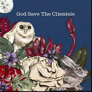 God save the clientele, I think that the use of nature in this album cover would work with our concept thus could be Incorporated as part of our digipak
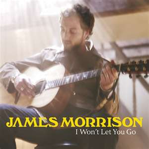 James Morrison, I think this picture is perfect for our concept, the light streaming in works really effectively and is something i would like to use.
B: Focus Group
Here is the powerpoint i used in order to ask the questions...
My results...
Wednesday, 5 October 2011
K: Digipack inspiration
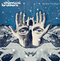 The Chemical Brothers
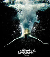
 KLAXONS- Surfing the void


K: Digipack

K: Focus Group
K: Ben Howard: Video styles and Ideas
K&B: Printwork Brief
We aim to publish our advertisment in magazines such as 'Vice' a free indie magazine, 'Love' a more maintream magazine sold nationally based on music, arts and fashion and a more daily local london newspapers such as 'The Evening Standard'; this particularly reaches a large target audience especially for our folk genre.
Our campaign will be either an 8 panel digipack with 1 advertisment poster or 4 panel digipack and 2 adverts. Initially we would like to create the 8 panel digipack and 1 poster however we must consult Lilli first.
Kitty and Becki will be creating a unique digipack to suit the theme and chosen genre and Lilli the advertisment poster.
Monday, 3 October 2011
K: Vintage Style Influence
Beruit: Postcards from Italy
K&B: Concept ideas.
- Based on a narrative around a young man singing about a local girl who committed suicide. He applies her life to the lives of others, looking at random people in this small town.
- Meat shots of young male, lip syncing some lyrics, 'Still don't you forget'. Location: Under tree as visual signifier of lyrics.
- When looking at the woman we will create a sense of surreality and purity using tea lights and Chinese lanterns. The opening shot a CU of feet strong sunlight behind, using the technique of pull back focus.
- We will focus the narrative on this young couple incorporating random people and locations part of their lives; the idea of love in every shot, whether family love friendship or relationship:
- We will also be using vintage family videos to create an 'old' feel reflecting on family love.
Family: Different ages united
Friendship: People and their pets
Pikeys and their gangs
Relationship: Based on this couple- hay bails, old couples, sitting in the field under a tree
- We aim to create a 'shabby Chic' look, an old seaside town; we will create this by using beach locations such as camber, Brighton and Cornwall also villages and fields in the countryside. We particular shot of hay bails dressed
- We want to focus our opening around the theme 'British youthful restlessness' through a montage edited narrative showing strong cultural codes.
Our main influences have generated from the following videos...
'Isles' and 'Joanna'- Little commets
'Big Day'- Torgny
'Candy'- Palo Nutini
'Stay Awake'- Example


