Wednesday, 5 October 2011

K: Digipack inspiration

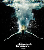
The Chemical Brothers

KLAXONS- Surfing the void
The image above is the back cover listing the songs, a black background with white writing and the iconic 'Klaxons' font works well against the other panels, with more interesting compositions; a series of photographs of different cats and the artists themselves- a similar mask style we previously researched.

K: Digipack


Seu Jorge - CRU

I love this digiack by 'Seu Jorge', how the face has been stylised into thousands of dots; this would work particularly well if in a warm yellow or orange tone similar to the colour scheme to that of folk indie artists and styles we have previously researched. The album cover displays iconic signs acting as a signifier to connote his band image. The simple costume and lack of extravagence connotes a down to earth soulful man not matierialistic; this is further reinforeced by his non verbal language, his deep strong eye contract directly addressing the audience. This use of extra digetic gaze allows the audience to recognise his presence in the music industry and call them in to listen.

This particular video beholds many african cultural codes, the facial expression and ethnicity creates a simple yet powerful digipack. The bold large text works very well to promote both the artist and the album with all colours in harmony with the background. Although we do not develop any direct visual associations and signifiers in this advert we do associate it with a particular style music, a Brazillian singer/songwriter expressing his strong soul music.

I like the simplicity of the video, the simple meat shot of the artist edited in quite a illustrative style; instead focusing on the easily read cultural code, constructing a certain genuine and passionate identity and methology through the product.

I believe the videos subliminary message is the idea that being natural and honesty is important, that fame and fortune isn't everything but to appreciate talent and music through a simple and humble man such like this artist.

The shapes are soft and complimentary aiming to represent a desirable lifestyle and music choice welcoming the audience to become part of his narrative and world. Although the composition is quite safe it is attractive and particularly suits the genre. With no large white spaces the artist isn't seperated with the audience but apart of it; suggesting how we are all created from tiny dots and particles to create a large nation, not too busy but still very eye catching.

K: Focus Group

Today I constructed a focus group based on our chosen song, Ben Howard's 'Promise'. This audience research allowed me to ask a general question to 5 people of 'what our your initial responses to this track?' followed by others such as 'what does it make you think of and what do you visualise when you listen to the track and read the lyrics?' and 'how does it make you feel'. These questions were asked after the group was presented with the song to listen to, then the lyrics; listening for a second time generating a lot of ideas and producing first hand research of our target audience's response to our chosen track.


(Non verbal language, props, costume, locations)

My first candidates results include: A heart rending and sad song. Makes you think of those people loosing the girl, the friends family and loved ones in her community and how beautiful and picturesque the scene sounds and is described as. She visualises the love they feel towards her, set mostly in the woods and outside open air- rural fields. She imagines modern day romantic settings, rope props, floaty costumes with natural characters dreamy and preocuppied by her thoughts. This candidate imagines it to be filmed pre suicide; talking and solving problems persuading her not to do it; with a green colour scheme for the location yet white costumes.

K: Ben Howard: Video styles and Ideas


This video provides snippet clips into Ben Howard;s new videos; they maintain the autumnal softness we wish to create and the country folkness mixed with indie style montage editing particularly evident in the opening of this video.


I love the warm colour scheme in this video with the heavy use of shadows and natural sunlight. The video is made up of a series of shots, montage edited with no strong narrative or performance just exploring nature with about 75% of the shots where the artist is present.
The slow motion used on the bubbles shot and haybails work very well reoccuring through the video; combined with the successful use of pull back focus. The average shot length roughly 3 seconds but ranging from 1-5 seconds.

K&B: Printwork Brief

Today we were set the brief for our print work, we have been researching further into reoccuring themes for our chosen genre indie/folk music to help us identify our style of advertisment and digipacks.

We aim to publish our advertisment in magazines such as 'Vice' a free indie magazine, 'Love' a more maintream magazine sold nationally based on music, arts and fashion and a more daily local london newspapers such as 'The Evening Standard'; this particularly reaches a large target audience especially for our folk genre.

Our campaign will be either an 8 panel digipack with 1 advertisment poster or 4 panel digipack and 2 adverts. Initially we would like to create the 8 panel digipack and 1 poster however we must consult Lilli first.

Kitty and Becki will be creating a unique digipack to suit the theme and chosen genre and Lilli the advertisment poster.

Monday, 3 October 2011

K: Vintage Style Influence


Beruit: Postcards from Italy

This vintage style footage we wish to incorporate within our video; particularly when it says 'we were young'. We aim to use old family videos and they create a certain arty authenticity we wish to create.


K&B: Concept ideas.


  • Based on a narrative around a young man singing about a local girl who committed suicide. He applies her life to the lives of others, looking at random people in this small town.


  • Meat shots of young male, lip syncing some lyrics, 'Still don't you forget'. Location: Under tree as visual signifier of lyrics.


  • When looking at the woman we will create a sense of surreality and purity using tea lights and Chinese lanterns. The opening shot a CU of feet strong sunlight behind, using the technique of pull back focus.


  • We will focus the narrative on this young couple incorporating random people and locations part of their lives; the idea of love in every shot, whether family love friendship or relationship:


  • We will also be using vintage family videos to create an 'old' feel reflecting on family love.

Family: Different ages united


Friendship: People and their pets


Pikeys and their gangs


Relationship: Based on this couple- hay bails, old couples, sitting in the field under a tree


  • We aim to create a 'shabby Chic' look, an old seaside town; we will create this by using beach locations such as camber, Brighton and Cornwall also villages and fields in the countryside. We particular shot of hay bails dressed


  • We want to focus our opening around the theme 'British youthful restlessness' through a montage edited narrative showing strong cultural codes.


Our main influences have generated from the following videos...


'Isles' and 'Joanna'- Little commets


'Big Day'- Torgny


'Candy'- Palo Nutini


'Stay Awake'- Example